
How to make your scientific figures publication-ready (6 tips)
Camille Le Roy, PhD - September 12, 2026
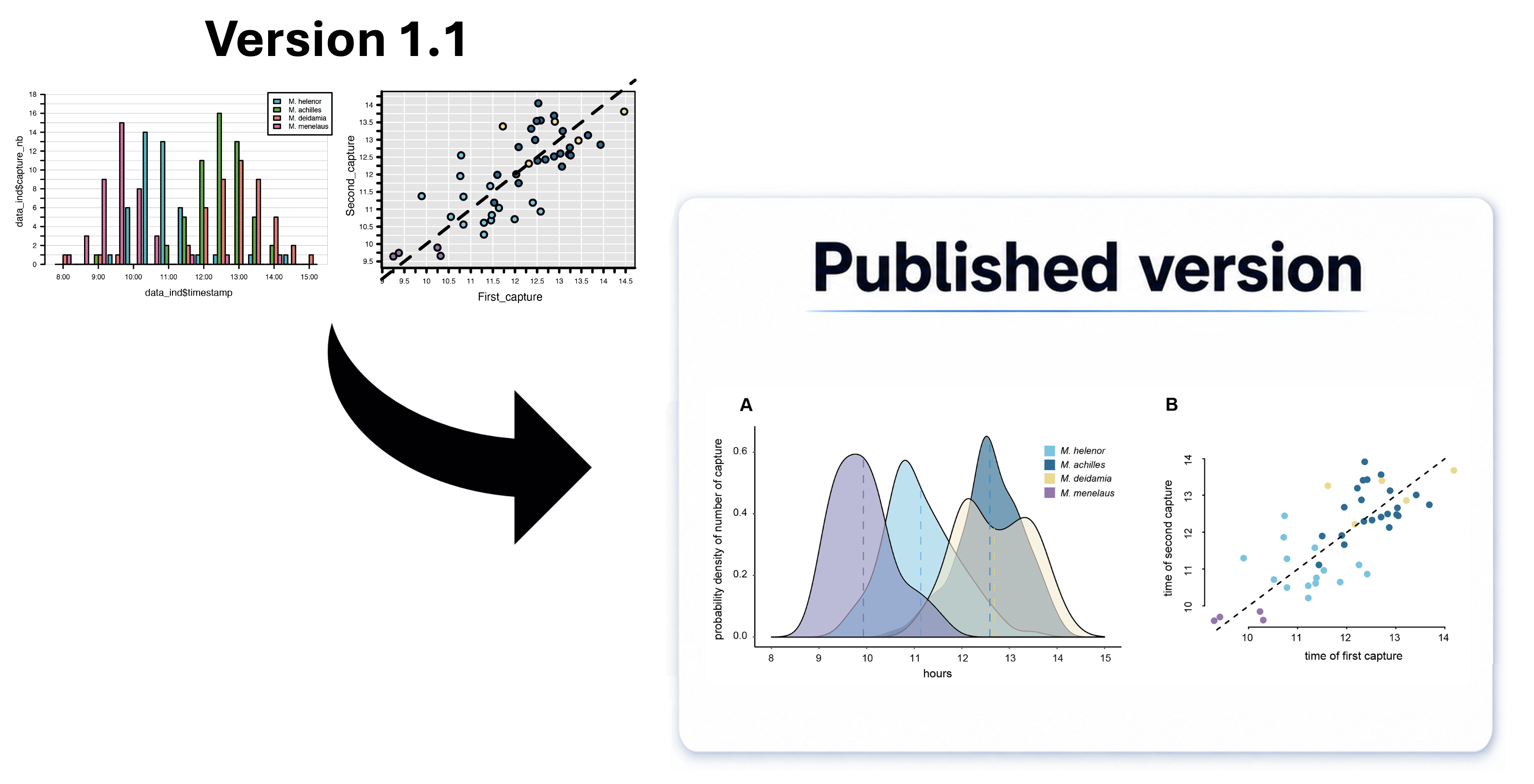
Have you ever stared at a published figure and thought: how did they make it look that good?
No one actually nails a polished figure on the first try. The road from your slightly - or really - ugly plot fresh out of R to a polished figure often takes many trials and intermediary versions. Drawing on my own research experience, I’ve compiled six practical tips I always use to make figures clearer and impactful, helping you reach that final, publishable version.
1. One figure, one message
Just like a paragraph, a figure loses power when it tries to say too much at once. When deciding what to combine into panels, think about the figure legend you’ll write, and how it will guide the reader through the story. If including multiple panels, they should reflect different elements of the same overall message. The order of your panels matters a lot: if panel A shows a pattern that raises a question, panel B can answer it, thereby satisfying the reader’s expectation.
2. Make color meaningful and consistent
We all have an inner artist wanting to make figures colorful. Try to channel that urge. If a figure doesn’t need color, it’s completely fine to keep it in shades of grey. That spares the reader the distracting thought of “what do these colors mean?”.
When you do use color, make sure it carries information: different colors for categories of a variable, or a gradient for a continuous one, in an intuitive direction (warmer = higher temperature, for instance). Also revise your color coding across the whole manuscript: if three colors represent your three treatment conditions in your first figure, keep those same three colors in every figure after that. Finally, it’s good practice to pick a colorblind-friendly palette from the start (see R Journal Palette Guide).
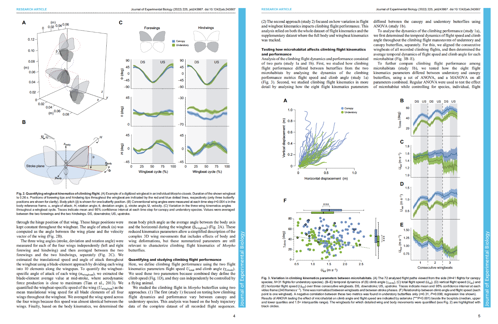
3. Layer information by combining color, shape, and size
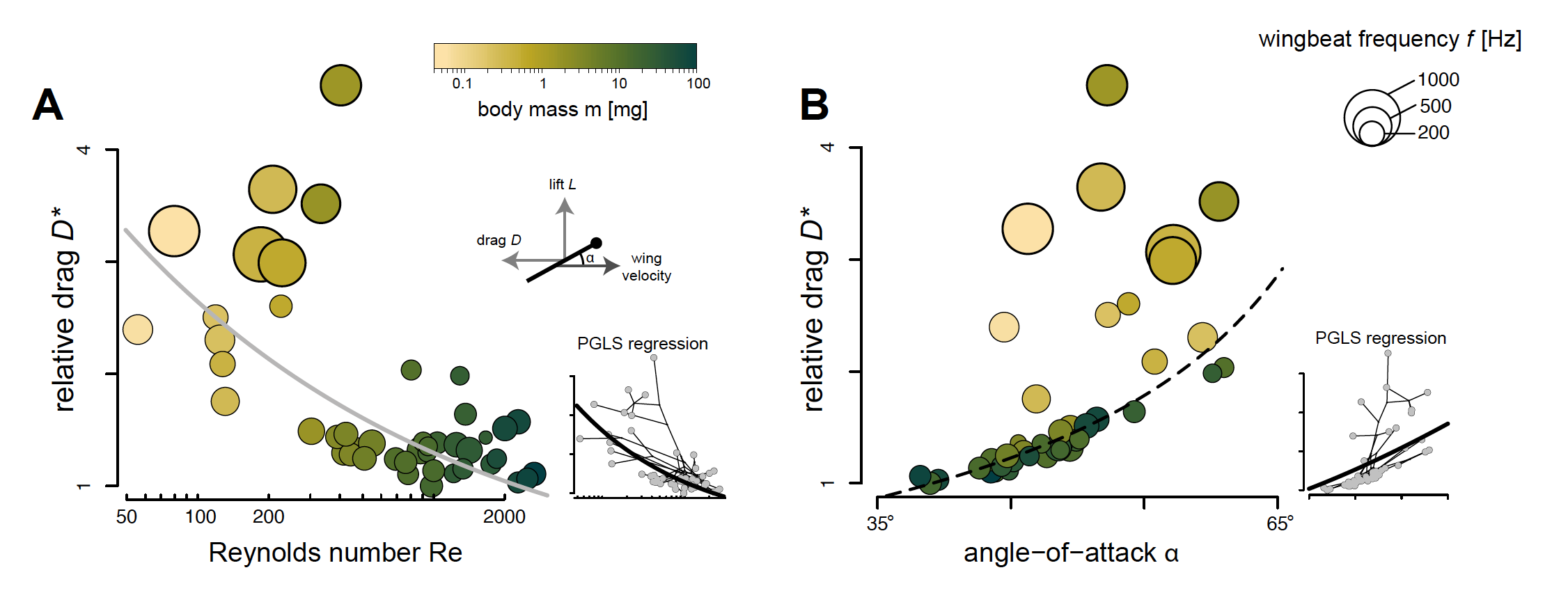
Journal space is limited, and you probably have more interesting results than room to show them. Keep your figure’s main message pointed in one direction, but you can layer in extra information through point color, shape (pch in R, marker in Python), and size. For example, in the scatterplot below (Figure 2), point size reflects wingbeat frequency while color gradient captures body mass — enriching the core aerodynamic relationship without cluttering the display. We could even layer in sex by using distinct point shapes.
4. Resize panels based on how much they need to say
If one of your plots is dead simple to interpret, it may only need two tick marks (say, 0 and the max value) and bigger points. Just shrink it. Doing so will free up space for the panels that are more complex and require more interpretive work. Varying panel sizes helps establish hierarchy. It guides the reader’s eye to your primary takeaways and keeps complementary details in supporting roles (see the use of the inset panel in Figure 2 for example).
5. Edit your figure outside of R or Python
Stop adjusting font sizes and line weights line-by-line in code! Unless you genuinely enjoy that, my advice is to take your figure outside your programming environment. Then export it as a vector file (PDF or EPS) and finish the polish in design software (Illustrator, Affinity Designer, Inkscape). Vector format also means infinite scalability — your figure looks equally beautiful as a tiny panel or blown up on a poster. That said, if you’re in a rush or prefer to avoid learning design tools, even basic tweaks in PowerPoint can significantly improve your raw figure.
Editing “by hand” lets you adjust almost anything (except the data, of course): element size and position, consistent fonts across panels, and refining colors. You can even draw custom schematics or illustrations to convey complementary details (see Figure 2A). Together, these small adjustments are what actually shape how clearly your result reads.
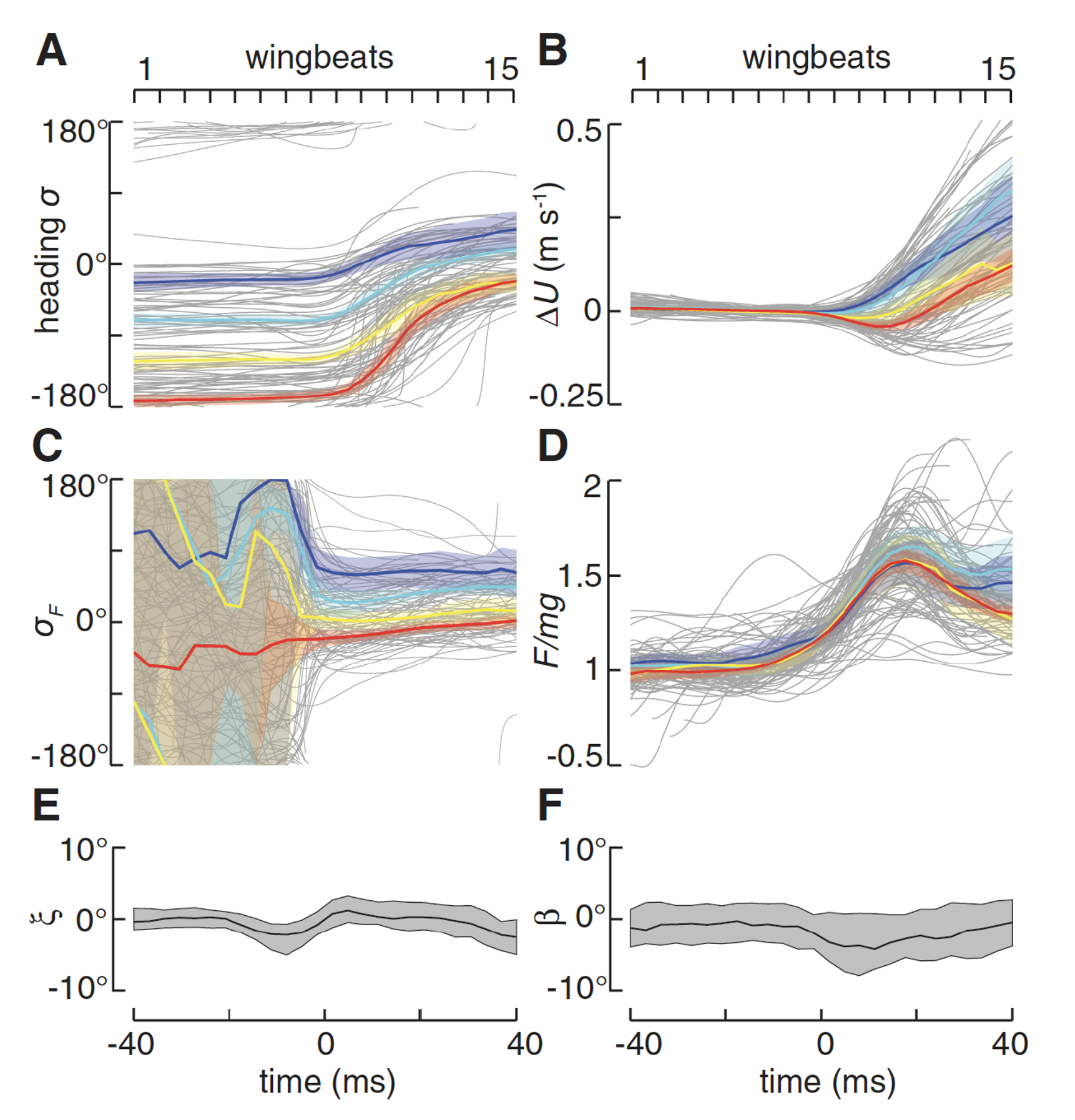
Original article: Muijres et al. (2014) Science, 344(6180): 172–177.
6. Find what’s unnecessary, and cut it!
You have a figure that’s correct and interpretable with some effort. Now ask yourself: what result do I actually want this to convey, and what’s standing in the way? Usually, you can easily spot elements to cut, such as:
- Unnecessary frames or heavy outer borders
- Redundant axis or labels
- Overcrowded tick marks
- Large empty spaces breaking up your panel flow
Remove all of this! Let the essential message reach your reader’s eye as directly as possible.
Feel free to book a free 15-minute call or send a message via the contact form.
We can discuss how to streamline your figures or manuscript!